Thursday, December 19, 2013

I had a chance to work on a fun collaboration this past month with an artist I look up to and a guy I'm grateful to call a friend. I have been admiring Oliver Hibert's art and career for years now, and, through the wonders of the internet, we developed a fast friendship that has bridged the 2,000 miles between us. Now, what started as a casual Instagram comment, has turned into my largest knit piece to date!

"Dead! Dead! Dead!" materialized as a limited edition screen-printed run for Oliver. I instantly saw its knitted potential with the amount of thick color-blocking he used. At the time, I didn't think the bottom half would be doable. How could I knit all those drips without having my own skull melt out my ears? Then I just haaad to go and be ambitious -- I didn't want to change his image so I decided to just figure out how to make it work.

Remember my first foray into Intarsia color knitting? With the "Aloof" pieces? Well, because of those projects, this piece was significantly easier, even though at my most complicated section I got up to 32 BALLS OF WORKING YARN ON MY NEEDLES, as seen in the picture above. Fortunately, a lot of the drips were small moments of color that I could start and stop relatively quickly before the yarns got completely tangled and hindered my progress. I had found in the past that placing the yarn balls in their respective tins helped with organization but really just keeping your balls small and being able to pull them through potential knots is what keeps this technique, and you project, from failing.

I also knew I would need to use acrylic yarn for this to get the brightest colors possible. I can't believe how nice (and cheap) this yarn was! I always associate acrylic yarn with the scratchy afghans my great-grandmother used to make, but yarn technology has come a long way since then. And since this piece is not intended to keep a body warm, you don't have to worry about its lack of insulation.

Here I am after I got back down to only the background color, and couldn't resist laying it out and getting a photograph. The main way I achieved the results I wanted and stayed true to Oliver's drawing was the sneaky use of duplicate stitch, a process where you go into the knitting after it's taken off the needles and "change" the color of certain stitches. Some colors worked better on top of other colors and some illusions were more successful than others. And I love how the duplicate stitch creates slight dimension in the piece that adds a whole nother level of interest for in-person viewing. Sorry, Internet, some things can only be appreciated in person!

Here is the piece in its (almost) final state. It won't be fully realized till it is stretched into a frame. That'll be way more attractive than this old piece of contour foam I have it pinned to for now.

One design element that I can't seem to learn yet is that knitting is not a perfectly square thing. If you design a piece on graph paper, and knit it exactly as you see it, your image will come out wider, giving it the appearance of being squished. That's why you see designs in books that look stretched out. I even told myself this as I was still transposing this image to a working knit pattern but didn't make any changes. I figured that since I would be stretching it into a frame then I could stretch it into its proper proportion. And I will mostly be able to do that but I kinda wish I had just made the small adjustment when I had the time. Why do we do these kinds of things to ourselves??

 I love it!! Getting to finally step back from this project has been so enjoyable, I can't wait for Oliver to finally see it in person. Alas, our lives don't have many opportunities to cross paths but mailing art is a lot cheaper than a plane ticket. Who knows, I feel like 2014 will have lots of exciting things in store for both of us.


On a final note, I wanted to say that Oliver and I met through us reaching out to each other via e-mail, phone, and social media. If I can offer any nuggets to chew on, I want you to not be afraid to reach out to someone you found on the Internet that you admire. Express your enthusiasm, ask questions, or just say hey! You never know what kind of response you'll get back but I find that those who look like huge successes are also just people, making it through their day-to-day. And you can create a fabulous website but it doesn't mean you have any idea who is actually looking at it. Many have warned about the isolation that can come from the computer, but I also see the potential to connect to people with similar interests that you would otherwise never get a chance to meet. Hey, you might even find a new friend :)


Wednesday, December 11, 2013

I finally took the suggestion people have been telling me to do for years and open an Etsy shop! Well, opening the shop is pretty easy and apparently I did that a few years ago BUT STARTING TODAY I am actually offering things for sale!! The prints I had made for my show earlier this year are now available for purchase -- some in larger quantities than others -- and if anyone has any feedback for me about what kinds of things you would like to see for sale, I would LOVE to hear them! I was thinking I could put original knittings up... 


Definitely have varied projects in the works that will be getting put up as soon as they get finished. I've been working with Spoonflower to get some fabric printed and, well, y'all just hafta wait and see!


Thursday, December 5, 2013

ARTIST VS. DESIGNER


ARTIST VS. DESIGNER
what do these titles mean to you?

SO, I had a bit of a personal revelation this year, and it had to do with these two titles. I grew up focused on drawing and painting, they were my idea of fine art and I defined myself within their terms. I enrolled at Savannah College of Art and Design under the impression I would continue into Painting and Illustration but quickly got turned on to the Fashion and Fibers departments. My thought was always that an artist shouldn't have a problem designing and designing was like "product art" or something. When I found myself responsible for designing clothes, I looked to my inner artist for creativity. 

Sounds pretty straight forward, right?

Well, not exactly.

I discovered a real anxiety would come up through my system every time I had to do my 50 fashion croquis a week; it didn't flow like the way art would for me. The illustrating, that was the fun part. Rendering designs and embellishing my sketchbook was where I felt confident. These pains still didn't tune me in to the inherent differences between artists and designers or how I defined myself by them. Maybe I just thought that I needed more practice designing before those feelings went away. 

Obviously they share a mutual base, heck, the school says in its name that it's for art and design! They both benefit from color theory, art history, business classes, interacting with and inspiring each other. What's different is where their motivations are coming from and the end result they seek. And good lord, you can find yourself some damn opinions on this topic when you google it (I like these guys' thoughts the most)! For me, design is more product-driven, more clearly defined in the message it wants to convey and its purpose. Art is more free-form, more expressive-based.

I came to the conclusion that I am an artist and not a designer, and it felt very relieving to understand that about myself. I probably could be a good designer with practice but I like this inherently-good-already art stuff, ha! Design doesn't do it for me like the way art does. And now I feel like I can 'let myself off the hook' when I think I can just sit down and design a poster or design a dress line. I at least understand not to approach it like the way I approach my artwork. Ironically enough, the knit art I've been working on for the past year feels more like design than any other art I've made, but I would still consider it art. Confused yet?

Alls I'm saying is it felt good to define what they meant for me and how I viewed and understood myself. I know everyone's always getting scared of getting older but I kinda love some of this growing up.

Sunday, December 1, 2013

A little snippet from my family's Thanksgiving festivities in Durham. Sister-in-law, Jess, snuck an awesome shot of me showing off my latest filet crochet endeavor. Getting mixed reviews on my choice of words on this one. How do you explain to your mom the artistic reasoning behind "Tig Ol' Bitties"?

Thursday, November 21, 2013

 Be With Me
wool yarn, stranded knit 
15" x 15 "
2013
SOLD!

The show at the Green Bean came down this past weekend, and I have now had the chance to properly photograph those pieces that were finished ... at 3 am ... the day of the show. I put everything in my car and, by the time I got in it to leave, the whole thing smelt like Green Bean coffee, ha! Didn't think about how the fibers would absorb odors.

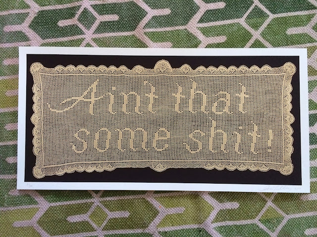
Overall, the show was a success. Sold one knitted piece and a few prints, and now the community knows me as the "Ain't That Some Shit" girl. It was the star of the show with everyone wanting to know "how long did that take you to make??!" I didn't track my time, but I started designing it in September and it was finished by the end of January. I worked on it at cookouts, road trips, and all through Christmas vacation, I would catch snippets of time when I had them, on top of longer days on my couch. Hard question to answer!

 Toothbrushes // Houses
wool yarn, stranded knit
12" x 12"
2013

I love this one. I realize it doesn't incorporate text, but I was so happy to finally be able to incorporate toothbrushes into a piece! I had this image of two brushes side-by-side rolling around in my mind for some time. There's definitely going to be a follow-up designs in this same style.

 Aloof #1 (blue)
wool/acrylic yarn, intarsia knit
16 ¾" x 30"
2013

  Aloof #2 (orange)
wool yarn, intarsia knit
16 ¾" x 30"
2013

 Aloof #3 (pink)
wool/acrylic yarn, intarsia knit
16 ¾" x 30"
2013

My brother thinks these 3 should be bought together as a unit, I had them individually priced, but I can imagine some cool ways to hang them together on a wall. They have been the most complicated design thus far, both in knitting and building the frame, but it paid off. I hung one of them sideways on my wall, and it's giving me ideas for a vertical-style knitting in the future...

Stay tuned!

Saturday, November 2, 2013

My boys and their respective antique quilts. 

The quilt on the left came from Pa May's estate, Adam's step-great-grandfather, after he passed earlier this year. Adam's mother, Dianne scooped up all the valuables from his house and hosted a family lunch, wherein she announced that we were to all pull 2 slips of paper from a bowl she was passing around. She had written each valuable on these slips, and we were to take the 2 items whether we wanted them or not! (Gotta love her manipulative organization) Lo and behold, I picked a quilt!! I was absolutely thrilled. She had taken the liberty of washing it, in the washing machine, which I wagged my finger at her for, but I'm secretly thankful for a must-free quilt. 

Novelty fabrics like this came into popularity in the 1920's and flourished through the 40's, typically designed with inanimate objects or scenes relating to leisure, and representing American daily life. Nautical motifs were particularly popular. I would guess that this particular fabric dates to the 40's. It's a very simple patchwork top, one half is patterned in red and blue, the other half in turquoise and purple in the same design, with machine-stitched, diagonal quilting lines. I was told that it was filled with horse hair but upon closer inspection, it's a cotton batting. I did a burn test on a sample of the filling and there was no presence of synthetic fibers so that potentially supports its age. It at least doesn't disprove my 1940's guess.

The second quilt is a bit older and has been with me for a longer time. My grandmother (once again) found the quilt top packed away in her house in Nashville, TN. (She grew up in west TN, which is where it probably originated) Being that it was only a top and never finished into an actual quilt, meant it was never used and in pristine condition. I took it home and finished it, hand-quilting it in the car when I moved out to Los Angeles in '08. Here it's pictured at a quilt guild meeting, where I was able to get it dated by a professional. She gave me the time frame of somewhere between 1900 to 1920. 


This is pre-novelty fabric era so you'll see a lot more plaids, stripes, florals, plains; and the scale of their pattern will be tiny. Scales in textiles designs have gotten larger and larger as we've progressed through the 20th century. The fabric here that I've placed my finger behind is probably the oldest fabric in the quilt, I would say second half of the 19th century. It shows its age beautifully and I was excited when I discovered it. Where there was once brown dye, it has now eroded the fabric due to the metals used in making the dye. It's a great example of old manufacturing techniques in textile history.

As you can see it now has obvious damage to it. When I first noticed the top starting to tear, I had the choice to retire the quilt to a protected, covered life in a closet or under a bed somewhere. I ultimately made the choice that it was something better enjoyed being used and accepted the fact that fabrics do not last forever. Because I was young and poor at the time, I chose cheap polyester batting to fill the quilt. As a result, it's a wonderful summer quilt because it retains none of your body heat, and I still don't regret the decision to keep it on my bed. I have admired its beauty and appreciated its function. And ain't that the reason we have these things in our lives anyways??

Friday, October 25, 2013

Working on gettin' back into a drawing habit. Finding ideas in my dreams.


Monday, October 14, 2013

Another hand-full of shots from my art show, currently up at the Green Bean Coffeehouse in downtown Greensboro, NC. Ahhh, aren't these three meant to be above the accoutrement table?? 

The two on the right are the only pieces I showed that weren't made in the last 2 years. They were work I completed back in 2007 while at SCAD, in the Beaded Surfaces and Structures class taught by the always-inspiring, totally-cool Sam Norgard. We were learning bezeling techniques (that's the circle of beads framing the central motif) and I had just received a badge-making kit as a gift. Using that, I decided to laminate Dave Grohl (on the left there) and subsequently worship him through encircling beadwork.

I was so happy with how he turned out that I went on to another music idol, Frank Black. This time I was able to work through the bezeling issues I encountered in the first piece, and elaborate with peyote stitching and porcupine quills. It's interesting how I found myself incorporating written word into my art even back then. I can't resist a good lyric! I used to constantly scribble lyrics all over my notes, on my backpack, on my jeans, and in various agenda books and journals as a teen, and I guess the power of words hasn't left me. I feel like I've changed so much since then but it can be kinda crazy to see the ways I never change.

Then, years later, I decided to revisit this small series I had started. I had a pill of a time finding the discipline to bead again. I think it's the scale that's jarring to jump back into. I can't even remember how long I worked on this (checkpoints documented here and here), all I remember is that every time I would have it out, Hunter would say "You're still working on that?" Needless to say, I finished it the morning I hung the show. 

Each piece is built on a wet-felted wool base, and thrillingly incorporates all kinds of found and collected tid-bits I've had in my possession over the years. That's probably my favorite thing about making these. It's like a mini treasure hunt every time I look through my stash!

Being that I have no shame, I recruited a guy attempting to sugar his coffee to hold these for me while I nailed them up. It's a community effort whether you're offering or not :)

Friday, October 4, 2013

McCann Brothers Quilt
65" x 60"

One quilt, three brothers, and their long history with sports.

I was a little down-trotted on this project after finishing the top. I felt like I didn't challenge myself, or do anything new and creative, but then I had a lot of fun with the quilting and that cheered me up. I wrote the three brothers' names with the piping that came from their baseball uniforms. I needed something loopy to break up all the squares and something new I hadn't tried before. 


I didn't buy enough backing fabric so I used what I could find to fill out the rest. They looked like the same color until I stood back to take this pic! Happy accident though, I really like the effect of the subtle patchwork.

A simple label with a good, motherly quote of Tammy's choosing; it fits, I believe. Typically on a label, you write where the quilt was made....but I couldn't decide where was where. Technically, I made the quilt in Hillsborough, Burlington, Durham, and Julian (not to mention Tammy lives in McCleansville). So what exactly do I write? I settled on North Carolina and moved on but I'm still mulling this over!

Didn't really think how the back would look when I traced around the App State helmet but love how it created this point of interest. I also traced around some numbers and found those popping out when I turned the whole thing over. 

You know, there is part of me that wishes I was doing more creative patchwork and not always making t-shirt quilts but there's still plenty of creativity to be had with projects like this. And everyone has these piles of sentimental, unworn shirts in their closets that are so much more appreciated in a project like this, I'm happy to be creating such special, personal quilts for my clients to snuggle under for years!


Sunday, September 22, 2013

So I went by the Green Bean the other day to get some shots of the show up on the walls. I have to say, the photos don't do any of it justice but I so badly wanted to share them that these will have to do! Half of the pieces were finished within hours of hanging so I guess it won't be till the end of October when I get a chance to properly document those pieces. Did I mention the show will be up through October now? That's pretty exciting since the High Point Furniture Market happens in October, so now all the interior design big-wigs can buy it all up!!

 This post I'm going to highlight the 3 "Aloof" pieces. This was my first go-round with Intarsia, a color knitting technique where the colors are connecting at points of change, but are all worked separately. This means every time you need a new color within a row, it needs its own ball of working yarn, follow me? So, starting at the top, things were easy, I had two colors, 3 balls of yarn and I got to start getting the feel for it. But then, as I advanced, more and more balls of yarn were needed. 6 then 12, then 15.

This is 15 working yarns here. In truth, it's not difficult to knit with 15 yarns, the difficulty lies in keeping the balls organized. There's a few methods I approached to dealing with this problem. First I tried the don't-worry-about-it method for a few rows and then would stop and reorganize. Next I tried sitting on the floor and attempted to keep the balls from moving while I fastidiously kept them in order every stitch. 
Not fun. 

 Then I went for everyone's favorite, the fuck-it method. Here I happily enjoyed my knitting while caring less about the balls behind my work. This works great until the tangle seizes up completely and won't allow you to advance any further. At this point, I was up to 23 working yarns active on the needles. WOAH. I decided to persevere with this method, cutting when necessary to free my yarn and just get the damn thing over with!

 Here I am after the storm clouds of wool yarn have rolled back and I find myself on the homestretch. When a new yarn is started, the tail is brought to the front, to keep it from getting mixed up and mixed in with everything else. Those have to be dealt with after finishing.

 Ahhh, peace and tranquility! How clean it looks! Success! But with one mistake, so of course that means I have to do another one. I also wanted to play with multiple color schemes, and liked them all so much that I couldn't decide which to do. Aaand some jerk told me to do all of them and of course I listened.

This is #2 or "Aloof (orange)" as its labeled. Color isn't very accurate in this image but did my best with the lighting available. I got organized on round 2. I had the wizened days of weeks past to keep me from jumping in so recklessly on this one. And instead of finding myself bored with repeating a design, I found myself knowledgable and was able to work more smoothly with less brain-wrapping attention given to my work. That was nice.

 Here we go, I found every possible can or jar around the house to test this theory of organization. Luckily for me, I have a plethora of large industrial thread spools from a local hosiery mill and Adam's old Bali Shag habits worked in my favor. This didn't work quite as well as I hoped, mainly when the balls of yarn got so small that they didn't have enough weight to stay in their proper compartment, but it  still was much better than any of my earlier attempts. 

By the time I got to #3, "Aloof (pink)", pictured top, I came to the conclusion that simply having small balls of working yarn that could be pulled through the tangled mess when needed proved easiest. This means from time to time you have to knot and add more when you run out, but it's a small price to pay. That, with the jars, was sufficient.

Now I'm looking at a new knitting project that is pushing me into the 30 balls of yarn range. Am I crazy???

Stay tuned...


Tuesday, September 10, 2013

We had the opening to our show on Friday, it was great! Thanks to everyone who came out and supported us. Megan did a little window graphics to add some enticement for passerbys. 

I'm realizing now that this is sorta my first real art show. Megan and I did a little show in a family garage a couple years ago but hardly the "putting-yourself-out-there" kind of venue as this. To be an artist, and suddenly find yourself and all your work in public can create very conflicting emotions. On the one hand, you have these pieces that you put incredible amounts of time, thought, and energy into, and you love them and believe in them and you want to share that. But now suddenly people are asking you where these words came from and how do you explain, "well see I was in this long relationship and it ended like this and I felt like shit and I felt these blah blah blah". And you open yourself up to criticism, which is really not that scary (Megan and I know about some criticism - we went to art school and we've already gotten torn apart!) 

The real anxieties I felt with this show came from two places: having so much attention placed on me and wondering if I am going in the right direction with my career, the latter being a mainstay these days that I'm thinking comes with simply being in my 20's. Have you ever heard Wayne White's expression "beauty is embarrassing"? There's something about getting praise or compliments or such that it starts to make you feel real uncomfortable and, well, embarrassed. And you totally appreciate it and it certainly means something to you but I found myself ready to not be the center of attention by the end of the night. I just want people to enjoy the show and enjoy the colors and textures and take whatever meanings they want from it all and allow it to put them in a new place for a moment. And I can watch them from the corner and feel smug in my little heart :)

Not surprisingly enough, I didn't bother pulling out a camera to document the show. That will have to come later! Here's the table while we were still figuring out wall arrangements and I got around to signing the new art prints. Can't wait to share the latest pieces when I can!!

Monday, September 2, 2013

Hooray! Another project finally realized!

I just had my birthday and when I was thinking about what I wanted to do on my day, I decided to finally see this dress into fruition. Then I could wear it to dinner that night AND to my art opening next week!

I can remember the exact day I thought of this dress, November 11th, 2011...
Then I got around to dying the fabric...just about a year later...

 This was around 2 yards of a sand colored double knit cotton that was leftover from my senior fashion collection in '08.

 I started at the top, writing with my chosen resist tool (pancake batter), and it shows that the longer the batter had to dry, the better the resist turned out. I couldn't just leave everything outside for days on end, so I had to commit to spraying the dye earlier than was ideal. BUT it's cool to see where the batter was still wet, it absorbed the dye and created the opposite of a resist. That's a whole nother technique in itself.

  The greatest nugget of wisdom I got from dying class in college was, to go into a dye project with all your knowledge but don't have any expectations about how it will turn out. Dye is an unpredictable medium, no matter how skilled you are, and it is A LOT more fun if you just go with it!


 Here I am using Skram's awesomely-huge table that's living in the upholstery room. This past week I closed the door on my sewing studio in Hillsborough and moved over here to Burlington. Jacob has been so kind as to allow me use of the upholstery room, being that it goes unused when I'm not in there working for him :)

 This is a simple dress pattern, modified from a silly Vogue pattern at Hancock's. Part of me might be too proud to use another pattern and not draft my own but part of me just wanted that sleeve pattern without the work! It's still not a perfectly tweaked pattern but it's getting there. I made a dress in the winter from this that had a longer hem and long sleeves, and there I tried out a neckline that didn't thrill me, so I'm testing a new shape and finishing technique for the neck on this dress.

 I'm happy the words are mostly unreadable, the idea was not to say anything but use script for its beauty. The words came from snippets out of my journal involving previous love and devolution of that love; those are in cursive. They're intermingled with lyrics from a Future Islands song, Before The Bridge; those are in caps.

Don't forget you need a left AND a right sleeve! Two lefts just won't cut it, and of course I didn't make this mistake..... I'm a professional.....

 Backyard barn posing, harder than it looks!