Showing posts with label color. Show all posts

Sunday, June 21, 2015

Liking Isn't Loving


I am so stinkin' torn right now about this project. The problem is that I just don't love it, but I really like it. The "liking" part is making it hard for me to want to scrap the project all-together. It has merit, but it just doesn't create that "I'm so obsessed with this!" feeling like most of my other knit pieces illicit. So do I frog the project or do I invest the time in finishing it?

I just don't think the background colors are successful. My attempt to deepen the gradient helped but it's still too rigid, and then the separation between the 2 yellows disappeared so I'm left with the uneven distribution of colors. It feels weighted in the wrong ways.
Now here is a successful color gradient! I knit Hammered//Enamored by hand so, moving slower, I was able to assess the color-change much more closely. Also, only being able to view the backside of the knitting while using the machine, limits my visibility of what I am doing. 

I don't know what I'm going to do. I HATE feeling like I wasted my time or, even worse, that my art progress is moving at the pace of a fist fight underwater. I want so hard to be prolific and react quickly on my ideas but with all life puts on each of us, it can be tricky. And I'm just not a person that can forego all other life-fulfilling activities for the sake of my art career. Sometimes I wish I was.

Have you ever been stuck about making decisions like these? How do you work through them?

Thursday, June 18, 2015

Floppy Drives and Embroidery Hoops

 The view from my lap this week. Over the weekend I had a chance to spend some one-on-one time with a seasoned machine knitter from my guild, Cindy. She was so gracious as to allow me into her craft room and utilize some of her ancient, expensive, and highly-coveted (by me) technology.

SO, my knitting machine has electronic functions -- so far, I have only explored the more manual aspects of these capabilities -- but I knew there were ways to take designs directly out of the computer and upload them to the machine, bypassing any need to input the pattern by hand. I had no idea how, hence my idea to ask for help.

SIDE NOTE: This year, more than any other year, I have found myself actively seeking help from others with knowledge beyond my own. It's a really good idea. And if there is knowledge you can share with them..well then the cycle of learning never ends.

In anticipation of Cindy's help, I challenged myself to make the largest stranded knitting design (aka- fair isle, aka- 2-color design) ever in my lil' history. I had parameters, mainly the limit of the width of the machine, which is 200 stitches wide. So I ran with that and this is what I came up with.

I started with the familiar, toothbrushes and houses, and from there, found myself creating new motifs. In my newest body of work, I'm beginning to comment on the wide-range of technology that's seeping into our day-to-day lives, with an emphasis on my dual love and hatred for all these screens. So that's where the satellite dish, iPhones + earbuds, and solar panels are coming into play. (Also you know where the solar panels are coming from.) The design was also inspired by a traditional rug layout. 

One of my inspirations for this design; I saw this rug in a museum on University of Georgia Athens' campus. Not only is the layout inspiring but I love all the little animal motifs!

This design is also a personal reaction/reflection of my own home. The solar panels that were built in my backyard were a source of great pain, but now in the wake of the dust settling, there is still much beauty around me as well as some surprising benefits as a result of the changed landscape. As in, we now get a great view of the sunset. So, there's another duality being expressed in this piece. A sort of harshness (chain-link fence) mixed in with cheeriness (flowers blooming).

Once over at Cindy's, we attempted to bring my DIY computer-knitted design into her pro knitting software called DesignAKnit, or DAK. It worked somewhat, but then I spent the next few hours cleaning it up and adapting it correctly to her program. It is such a cool program -- the next time I find $800 burning a hole in my pocket, I've got to buy this!! Once the design was completed, we hooked Cindy's Tandy floppy drive to the computer -- again, just the cord to adapt the drive to the computer comes at an exorbitant cost. It's basically an emulator function, these sort of external floppy drives were never meant to receive information from a home computer, rather you would buy the disk that had the design you wanted and that was that. We had to export the design into 6 separate tracks due to the limited memory space on my CompuKnit III. Finally, another cord connects the floppy drive to my machine, and we begin the uploading and knitting process.

Are you still following me?? 

Ok, now here's how we actually got to knitting. We uploaded the first track from the floppy drive onto my machine. I get it set-up with proper orientation and I start running the carriage. When we get to the end of the programmed design (carefully cause the machine will automatically begin repeating the design so you hafta hafta make sure you end on the exact right row), we plug the floppy drive back in and overwrite Track 1 with Track 2, and knit again. There's some careful steps that needed to be taken between the designs to make sure they lined up correctly, Cindy and I would speak out loud for every operation so as to be constantly confirming with each other that we had done everything. This went on for all 6 tracks before we were finally finished. 

OH, ALSO during this time, I was attempting to create a gradient with my background color. See, I forgot until the night before our get-together that I would have to to bring all the yarn I needed with me and that I would require more than one ball of yarn to complete the project. That's new for me to need larger quantities of yarn. So in a pinch, realizing that I didn't have enough of any one color, I decided I would used 4 similar colors, and create a rough gradient through changing lines. Knitting 2 rows of new, 4 rows of old, 4 rows of new, 2 rows of old, and finally changing over to the new yarn color. In theory, this made sense to me.

SEE PHOTO BELOW

Was NOT happy with the result (this is the best picture I took of the lines showing). For the first color change, the 2 different yarns were so similar in shade that it looked good. But for the yellow-to-green, and then green-to-blue... I wasn't happy. So more need for ingenuity. That's where the embroidery hoop comes in. I decided to deepen the illusion of a gradient, and remove the harshness of the lines, through duplicate stitch. Basically an embroidery stitch where you're going over the existing knitting with what looks like a typical knit stitch, one at a time. I utilize this technique often to garner the results I desire and to add complication to my design. 

It's a slow process but it's doing the trick! I'm about 3/4 of the way through so when I get it done, I will share a photo asap!

~~~ THOUGHT NUGGETS ~~~
I have been a little reticent about fully automating the knit process, just because to me the making is the beauty, and I never want to take away from the making process. But, I also see the wonder in being able to allow my ideas to come to fruition more quickly. Especially since no matter how many hours there are in the day, I never feel like I can get anywhere very quick. It's in those times when I feel frustrated about how slowly my projects are coming that I remind myself of the journey and how with enough baby steps I can get there one day. Just maybe not this day.

The reality of me being able to further utilize these automated abilities is limited, unless I'm willing to invest in the equipment or if Cindy can tolerate me being over at her house all the time :) but I'm glad to know how they work now and know that it is an option.

~

As to my sewing machines, they're far from gathering dust! I'm playing with making my own underwear, inspired by Amy from Cloth Habit. The idea was sparked from my desire to live a handmade life. Thus, now when I'm in need of a certain material possession, I try to figure out if I can make it first before I go shopping. Not to mention, I see all the scrap fabric that accrues at my 9-to-5 and we've been looking for ways to use as much as we can and throw little away. Amy provides a FREE pattern for this panty (I only customized it slightly with those diagonal seams. That was to cater to the scraps that I was working with) and this has got to be the best style of underwear anyway, so no need to improve upon it!

Finding much needed time outside with my boo thang at the frisbee golf park :)

Hope you enjoyed, thanks for reading!!

Monday, May 11, 2015

Sprang Update

New shipment of yarn arrives = I've got some big plans in the works! I'm starting to buy multiple balls in my fave colors in anticipation of larger projects.

Until then, why don't I share what I've been up to these past couplea months! I haven't been getting as much done as I would like due to now working a part-time job but it's just a matter of time before I rebalance.

I'm starting to explore the differences between hand and machine knitting. These 2 guys are the same toothbrush design, same yarn, same number of rows cast-on, but the left is done on the machine and the right is done by hand. It makes me realize what a loose hand-knitter I am! Doing intarsia color-work on the machine, you can't help but have a tight tension and I'm really enjoying it because it adds a sharpness to the design. Not to mention it now means I can pack in more detail into a smaller space. 

My tiny houses have gone super tiny now with the tight gauge. This guy measures 1.5" x 2.25". Can't wait to start designing these house more intricately, especially since this house is too tiny for any of my tiny frames, hehe.


These toothbrushes tho, I think I might prefer the look of the hand-knit here. See how varied the 2 brushes are from each other? The machine would add a uniformity that I believe would take away from the character of the design. This piece recently sold to a buddy of mine who reached out via Instagram, I appreciate his support! Eventually I would like to put a series of pieces up for sale online, until then, it's been individuals who reach out to me that I'm selling to for now. Still figuring out outlets for my work. 

If you are EVER interested in purchasing something you see here or on any of my web platforms (website, Instagram, Facebook) PLEASE CONTACT ME! If you love it, I want to get it to you!!


I'm now an official member of the Triangle Machine Knitters Guild based out of Raleigh :) they hosted a 5-day spring Knit-In at a local nature preserve that was a great opportunity for me to be in a room-full of experienced machine-knitters. That taught me some many little things about my machine -- like how do I adjust the volume? Is my frame set up right? It was great. Not only are they talented but fun company as well.

Got some knit inspiration off the TV the other day -- I couldn't figure out how they were knitting and purling with the same yarn but getting 2 different colors. When I brought my sketchbook in to the Knit-In, I was instantly taught about plating. Plating is where you carry 2 yarns as you knit, where one color is carried in front and the other in the back. This way the purl side will be a different color than the knit side.


Not only did I learn what plating was, but I learned I could do it on my machine! Mine came with a plating yarn feeder that can hold the yarns front and back.

Here is my first sample with the plating yarn feeder. I love the way that the contrasting yarns create a flecked sort of look. This swatch is way too stiff because I used 2 fingering weight yarns. To create a really nice fabric, I need 2 yarns that when combined, make a standard fingering weight.

Here is a piece I got done during the Knit-In. Can you tell what it says? I'll give you a hint: the dark lines are the shadows of the letters. I originally knit this design at home, and had my fair share of trials-and-errors...

...the biggest lesson being 1) I can't watch TV and machine-knit like the way I can by hand, and 2) understanding how to correctly flip my design so that it comes out the right way. See, when you knit by machine, you face the purl-side of the fabric (aka, the back-side) so you can't really see the finished side until you cast-off and remove it from the machine. After knitting my writing backwards not once, not twice but 
3 times (that's where the not-watching-TV lesson was learned), 
I finally realized what I was doing wrong. I would flip my pattern in the computer and then read the chart top-down, which would flip the pattern again. Flipping twice means backwards letters for me.

After maintaining my zen and dutifully ripping back, I finally got it right. Alas, even then I came to the decision that this bit of cryptic text might be too cryptic. So I decided to knit it one more time (the green one above) and loosen the tension (allowing more space between the letters) and shortening the letters overall. It's still tricky to read but no one said understanding art was easy!! Also framing it properly and being able to stand back from it helps :)

Did you guess what it says yet? TURD ON A LOG, duhhhh!!!! It's a phrase I use often when I feel like I'm not getting anything done, or I've watched too much TV and not done the laundry. I have no idea where it came from but it has become a part of my regular, nonsense lingo.

Ok, so maybe understanding art can be easy too.


This is another quick study I did at the Knit-In. Here I was inputing single motifs (one bird or one flower) and then using the machine's computing abilities to repeat and flip them as I desired. For me, this is where this software makes sense. I wouldn't want to input a large design like "Turn On A Log", especially if I know I only want to knit it once. I would rather input small motifs and have fun repeating them in various ways.


I've got some big plans for the next few months, focusing on my goal of scaling up. Now if all these friends of mine would quit being so happy and getting married then I would have more time to knit!!

Stay tuned...

Tuesday, March 25, 2014

NEW ART SHOW + Color Conclusions


HAND IN HAND
...an art show by Ann Tilley, is a multi-colored explosion of knitted and crocheted art pieces telling the small stories of relationships in the home. A symbology of everyday objects expresses the intimacy of shared spaces. Painfully familiar one-liners pulled from the world’s journal wrapped in the cuddly kitsch of textiles. A personal inner voice experiencing love through fragmented text and the ordinary. 

What does your toothbrush say about you?


That's the write-up for a new solo show of my work going up in Harrisburg, PA next month! My bestie from SCAD days owns a store up there, STASH, that functions as a treasure trove for vintage clothing, a resource for the local and handmade, an art gallery, and an anchor for the young community that's slowly revitalizing this historical downtown. The show will feature more of my object work rather than my text work; all those toothbrushes and houses that have spawned out of the original LOVE SIGNS show I put on last year. This is a great opportunity for me to get my most recent knittings framed and get a chance to visit a dear friend. It will also be the first time I've shown my work out of state. Does this mean I can call myself a national artist?? Yes? Okay, I'll go ahead and add that to the other inflated text in my resumé :)


------------------------------SIDE NOTE----------------------------
I remember when having a resumé was SUCH a big deal. I used to stressss over getting on the computer and trying to design that wow write-up that was going to get me my dream job, whatever that was. I eventually hand-wrote the entire thing because I couldn't find a font that made me happy. Did you ever find it important to actually have a resumé? Or was that just another thing you did at the end of school because everyone told you to do it?
----------------------------END SIDE NOTE------------------------

~

On to COLOR CONCLUSIONS...

As a follow-up to my last post on color...I figured out what was bothering me with that knitting I was struggling with and how to fix it. In fact, the resulting work is the center image in the poster above. And wouldn't you know, the answer came from my own damn advice. I guess I finally started listening. 

Here's the backstory and ultimate conclusion I came to: 

I have an idea in the works for an outside installation, and I needed bulky yarn. So I went to Knit Picks and ordered nearly every color they have of their Brava bulky. While it was en route, I thought I could further utilize this new yarn in another toothbrush piece. So when it came in, I picked colors from my options and failed to make something that made me happy. Why? The first conclusion I came to was when I traded the olive green for a bright chartreuse green. I realized that olive green is not one of my colors. Chartreuse green is. What had led to my failure was that I ordered every color they had because I wanted options, not because each of those colors spoke to me. The way that I build the color stash I work with is to buy the colors I need for a project, when I need something specific, or buy the colors that stand out to me. And I don't just buy from one place. I do this in every yarn store in my area, as well as online. This means that when I approach my yarns to design a new knitting, I'm working from my color wheel. This gives me the greatest chance for success because I've already said 'yes' to each of those colors. I see now the mistake in buying every color from one vendor. There are probably yarns in there I will never use. But, on the bright side, I now understand a part of my process and the importance of allowing myself to buy yarn organically as I see something that compels me. 

It's just like being in a relationship. The more you understand they way your partner ticks, the way you react to situations, what does and doesn't work; you get better at being together. 

The better you start to understand your own artistic processes, the better you can be at your work. And we can all stop making things we don't like!


Monday, March 10, 2014

Working with COLOR

After the debacle that plagued me yesterday (see above), and continues to leave me uncertain this morning (do I like theses colors??), I know exactly what I want to talk about today. 

COLOR
- how to make smart decisions in the design phase, how to use lots of color successfully, and the methods I employ to keep from tearing my hair out and wasting my time making projects I hate. 

I will be talking about the way I use color in knitting design, but these ideas can be used in any kind of project to help you make good color choices. As for the project I started yesterday.... ...STILL can't tell if I like the color choices or if I should abandoned the sinking ship before I commit any more of my time to it. And since I can't get anyone around me to make my decisions (shucks) I guess I'll mull this one over a while longer...

I can tell you straight up that designing color knitting is the hardest task I've ever encountered in terms of making successful color decisions. With quilting, you can lay piles of fabric next to each other and get an idea as to how they will look together. Markers, paints, a little more challenging as you have a certain shade or tone when it is wet and may differ when dry. Knitting? Well, there's something there that one cannot foresee. Simply placing balls of color next to each other may look nice but provides no guarantee that they will work well together once you've spent all that time knitting them next to each other. It is an enigma that has led me down the path, more than once, to failed projects. See example below:
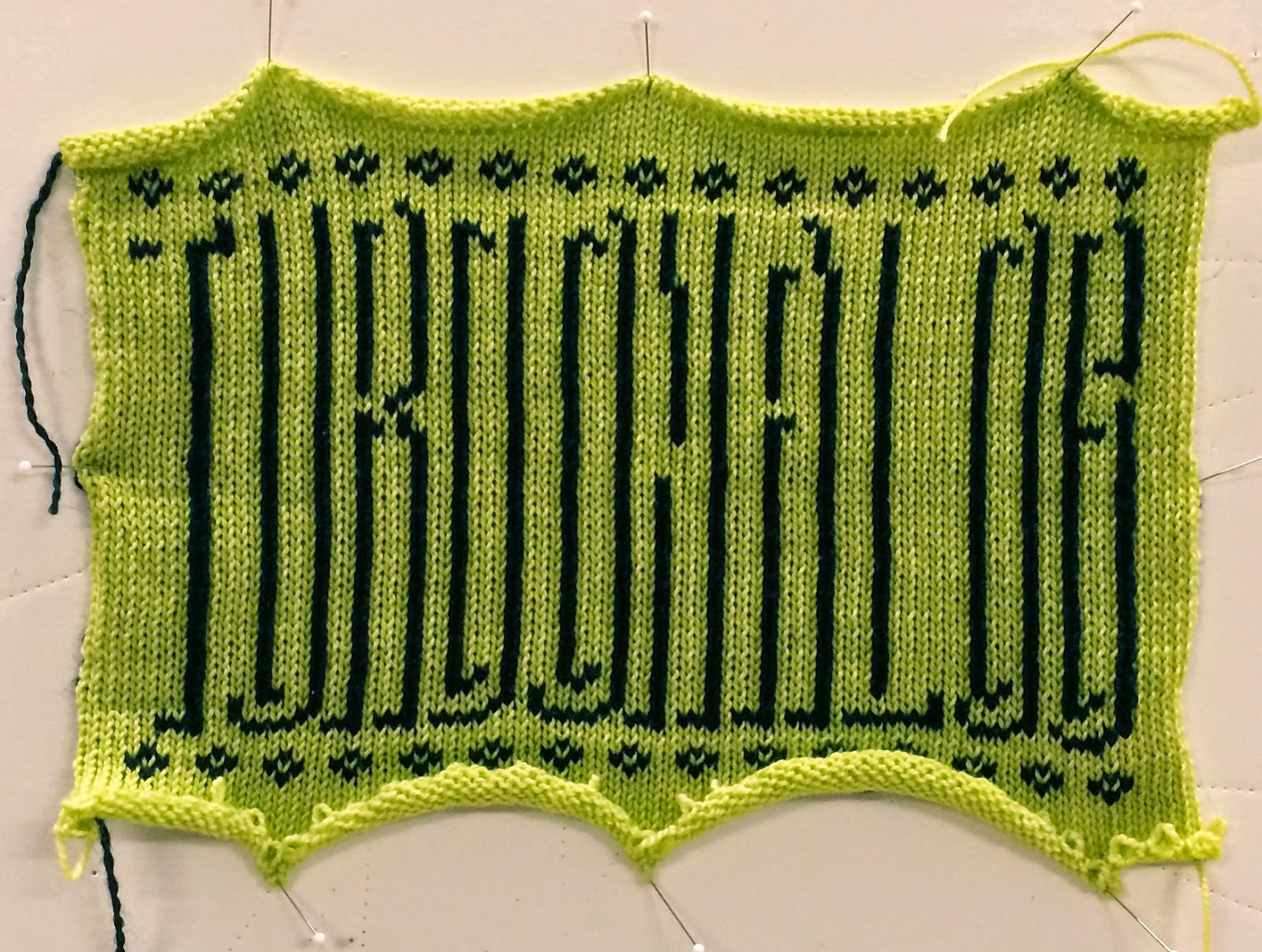
 TOTAL FAIL!

This was the very first knitted text project I ever designed and made. I had an idea as to what I wanted to do, but the whole process still overwhelmed me and I hadn't figured out the tools to allow me to design a piece successfully. I knew I wanted to employ color knitting techniques (in this case, stranded or Fair Isle, the only one I knew at that time) and I wanted lots of color. SO, I thought I would be clever and just buy a yarn that automatically changed colors, that makes sense right? Well, what I didn't foresee is that some colors, placed next to similar colors in shade or tone, will completely disappear next to each other. I learned that lesson the hard way but the important thing was that I learned.

I could talk about color theory; the color wheel, tint, hue, shade, tone, blah, blah, blah. As much as this information is valuable, even I can feel it breeze over my head when trying to understand it in book terms. I have taken years of color theory and would be stumped if you asked me to define tone. (Go google it if you need to know, that's what I just did.) Instead, I'd rather empower you to trust your gut, use colors you love that make you happy, and maybe try out some of these tools and tricks I like to use, to make the decision process easier.

 This little tool I picked up at my local yarn shop. Created by Gail Callahan,  she's basically found a way to break down the color wheel and give you quick color options instead of trying to explain why. And sometimes, don't we appreciate just getting an easy answer?! I use this to help me come up with different color stories in the very beginning. 

 You start by placing your base color (the one color you've actually forced your brain to make a commitment to) in the large circle in the center. Then the guide immediately shows you various lighter, darker and similar versions of the color (some would say tints, shades and tones but let's use simple terms). These obviously will work with your base color because they are pretty much the same color. But then she also shows you the complementary color to your base. A great example of this color palette in effect is the very first quilt I made (seen here) I was new to quilting so I decided to just pick all green fabrics. But, to make a successful design, you need contrast and focal points. So, I used the complementary color of green --red-- as my center in each square. Lots of the similar colors (the ones in the circles) and a pop of the complementary (the color in the bar).

A very basic way to divide all color is between warm and cool colors. Your warm colors are your reds, oranges, and yellows; think of a fire. They are most commonly associated with the feelings of energy, action, and, of course, heat. Your cool colors are your greens, blues, and purples; think of ice. They produce feelings of calm, peace, and the nighttime. One of the reasons why complementary colors work so well is because it will be the opposite "warmth" of your base color. Red and green. Purple and yellow. Blue and orange. If you painted a canvas full of cool colors and then put one dot of red on your piece, the eye would go to that red. The contrast that lies between warm and cool provides interest in your composition, so use it to your advantage!

Also, considering the energy that a color can bring to mind can influence the way your work is perceived. I intentionally chose mostly cool colors for my toothbrush piece because I wanted it to be a peaceful, calm image.

Me being somewhat of a snob, thought that this kind of tool is just showing me information that would be obvious to me, what with alllll my higher education  >nose-in-air<  but it just makes it so you don't even have to pry that information out of whatever crevice it has settled in, and it really just makes it easy to keep thinking of new ideas.

I'm sure there are more types of tools like this one on the market. Consider picking one up to help kick start those brain-thinkin' juices.

This next method helps you look at color....by almost removing it entirely. So, what I've got here is a piece of red transparent film. I'm not exactly sure what type of material it is. It was a leftover scrap from a project my college roommate was working on, and I snatched it up. There are red viewers that you can buy for this purpose but you can use whatever is available to you. (I found one here.) All you need is something that is red and see-thru. The idea is that you look through the red at your project. The red acts as some sort of color blocker, and shows you basically a greyscale version of your work. It is good to see a greyscale of your work because the contrast of a light color next to a dark color is going to have more of a visual impact than two colors of equal darkness. You still might see a difference between them when viewed in color, but you won't get that extra variety or pop.

Here you can see that I employ all three basic levels of color contrast: light, medium, and dark.   Because I'm rendering an object (in this case, 2 toothbrushes), I want to show the dimensionality of the item. If I put 2 toothbrushes on a table and looked at them, part of them would be in light and part would be shaded, a cue to your eye that what you're looking at is in 3-D. So I've got my dark colors on one side that make it look like there's light coming from the other side. I also want to make sure they don't get lost in the background (think about my failed project above) so it's good that the majority of the brush is in contrast to the shade of the background color.

Finding contrast using a red viewer is not just for designing an image to look 3-D. It can be a great way to find balance in your project. It gives you an opportunity to look at your work from a different perspective; the closest you'll get to looking at something with a different set of eyes. Take this example here:

This is a rug I made several years ago. The color choices were not premeditated and I instead would pick as I went along. I knew that I might run into some overall visual problems if I didn't somewhat consider what I was using beforehand, so, I decided to use the red viewer. With this tool, I chose to alternate light, medium, and dark yarns evenly as I worked. 

As you can see, I didn't do it precisely, but enough to create an overall balance to the piece. It also just helped from a decision point-of-view. Sometimes, when you have 50 choices, it can be harder to pick one rather than 5 or 10 choices. (In fact, it's been proven to be the case ---> Sheena Lyengar's TED talk) So, limiting myself to my only the dark yarns or only the light yarns, just simply made it easier to keep progressing. You don't want your inability to make a decision to keep you from moving forward!

Okay, so it seems like the red viewer idea only works after you have made something. How do I come up with color choices before I start? I'll get to that next!

When I design my knitting projects, I do this initial work in greyscale, like I'm starting with the red viewer over my eyes. This allows me to only focus on composition and structure. I'm breaking down the design process into chewable parts. When I feel happy with my work at this point, I move on to color. 

I design my images in a spreadsheet and then import them into Photoshop. Actually, Photoshop Elements, the more affordable little brother of Photoshop. It works just as well for this sort of project. Here I can play with color easily and quickly. I will sit in front of my yarn, in a  well-lit space. Natural light is a MUST. As much as I want to sit on the couch and work, my den has very yellow bulbs and I don't get an accurate depiction of color, when looking at my yarn in this light. I only work with colors that I already have in yarn-form. It's easy enough to pick any color in the world off Photoshop but then trying to find that exact color in yarn version? Not so easy. Work with the colors you've got to alleviate future headaches. Here is another opportunity to use that red viewer. You've already decided that a dark color needs to go in this one space. So put on your red eyeballs and pick out those dark yarns that fit the bill.

The computer is an absolutely valuable tool when you want to test out an idea before you start. If you do not have access to these sort of tools, there's always good ol' paper and markers. The hard part with this way is just your limitations on how accurately you can recreate the colors of your final material or pigment. 

~

SO, when interpreting a color that you are thinking about using, consider these two factors:

-- what color is it? 
(is it warm or cool? If all the colors you picked are warm, consider something in the composition that you want people to look at and make it a cool color)

-- how light/dark is it?
(how does the color read when looked at in greyscale? If your composition has all medium contrast colors, consider a light or dark color to add interest)

Understanding these two basic ideas can help you pick a successful variety of colors for a project. When it comes to the actual selecting of colors, go with the ones that excite you and that you think look good together. You will ultimately be living with the final project, whether it's a personal piece or something that goes out into the world with your name on it, so put your colors into it. If you're not sure what colors are your colors, look at your wardrobe, look at your house. What colors are most commonly found? What colors make you happy? Inversely, what colors annoy you? It's good to know those so you can avoid them! Look at famous paintings you love and break down what colors were used. Eventually you'll develop your personal palette that you'll come back to again and again. Using these tools will simply help you put them together in a successful way!


Do you feel like you have an innate sense of color? Or rather, do you find tools like these crucial?


Wednesday, December 16, 2009

I'm in a total knitting and crochet mood right now. I found Vanessa's blog, Do You Mind If I Knit, and have been enjoying being inspired by her projects and choices of color. It was hard for me to pick just a few pictures.


Makes me want to live a technicolor life!


Saturday, October 31, 2009

Tuesday, August 4, 2009

Than got an awesome new camera this week; a Nikon D90. Every picture you take on that baby looks beautiful.


The morning glories blooming on our front railing.


A jar full of bows sitting on my fabric shelf.

Sunday, August 2, 2009

Dripping Color


Lucy
Check out her Chlorophyll Skin video involving lots of colorful dye.

Wednesday, July 29, 2009


Giles 2009 Resort Collection
designed by Giles Deacon and styled by, who else, Katie Grand.
I love the look of the red wig with pale pinks and fresh neutrals. The whole show is awesome, see it here.