Showing posts with label inspiration. Show all posts

Wednesday, April 13, 2016

Spring Design Inspiration


Ann Tilley Handmade's spring collection is here!


Take a look here.


I'm still hanging on with this clothing line idea, I feel like I've created my own personal grad school with how steep my learning curve has been. Attempting to stay in front of the season change has been crazy! Mother Nature got me all scared cuz we started having spring/summer weather like weeks ago and I was panicking cuz I was still trying to sling long sleeve tops. It cooled down again but it certainly got my butt into gear!


A central start for my designs is looking to my own wardrobe and what I love to wear again and again. 


Enter my all-time favorite black pencil skirt, made out of a stretchy black knit that was starting to look worse for the wear. I had never been fond of the way the waistband fit, hence I'm hiding it with a big belt ~ prime inspiration for an update on a classic. I had also been fantasizing for some time now on a great wrap skirt (check out my Pinterest board inspo!). Thus, the Goddess Drape Skirt was born. 

I wanted maximum drape, full of texture and maximum comfort. Folding the fabric allowed me to get a clean edge on the front drape panels and doubled the fabric; acting like a lining.


On the opposite end of designing, there's starting with a fabric and trying to figure out what to make with it. I had planned to design a wrap dress but discovered the fabric I intended to use was much too stretchy for my original intentions. Then I just started playing and discovered how much I loved the look of an over-the-boob wrap top. Being large-chested, a standard wrap that crosses your breast can easily put you into lady-of-the-night category if you're not careful. I love that here you can get the ease of wearing a wrap with the benefit of full coverage. Having your arms exposed and the cropped hem length keeps you from looking too matronly. 


This dress was inspired by a vintage girl's dress I found in a shop in downtown Pittsboro. 


It was much tighter and shorter and had red stripes -- the neck was so tight I had to cut it larger to get my head in! It proved to be a little too small for regular wear and it got cycled out of my closet. I think we all know what it feels like to find a great garment that had that one flaw you wish was different. The beauty of designing from your own wardrobe is getting a chance to fix that flaw!

I'm strugglin' a little because I made this dress months ago after finding the perfect striped ponte fabric, and now I'm having trouble getting my hands on more fabric, to be able to offer this look to my customers. I'm gonna have to play it by ear and settle on another fabric if I can't get anymore.

Hope you enjoyed a peek into my spring collection and design process that went into it all!


Thursday, June 18, 2015

Floppy Drives and Embroidery Hoops

 The view from my lap this week. Over the weekend I had a chance to spend some one-on-one time with a seasoned machine knitter from my guild, Cindy. She was so gracious as to allow me into her craft room and utilize some of her ancient, expensive, and highly-coveted (by me) technology.

SO, my knitting machine has electronic functions -- so far, I have only explored the more manual aspects of these capabilities -- but I knew there were ways to take designs directly out of the computer and upload them to the machine, bypassing any need to input the pattern by hand. I had no idea how, hence my idea to ask for help.

SIDE NOTE: This year, more than any other year, I have found myself actively seeking help from others with knowledge beyond my own. It's a really good idea. And if there is knowledge you can share with them..well then the cycle of learning never ends.

In anticipation of Cindy's help, I challenged myself to make the largest stranded knitting design (aka- fair isle, aka- 2-color design) ever in my lil' history. I had parameters, mainly the limit of the width of the machine, which is 200 stitches wide. So I ran with that and this is what I came up with.

I started with the familiar, toothbrushes and houses, and from there, found myself creating new motifs. In my newest body of work, I'm beginning to comment on the wide-range of technology that's seeping into our day-to-day lives, with an emphasis on my dual love and hatred for all these screens. So that's where the satellite dish, iPhones + earbuds, and solar panels are coming into play. (Also you know where the solar panels are coming from.) The design was also inspired by a traditional rug layout. 

One of my inspirations for this design; I saw this rug in a museum on University of Georgia Athens' campus. Not only is the layout inspiring but I love all the little animal motifs!

This design is also a personal reaction/reflection of my own home. The solar panels that were built in my backyard were a source of great pain, but now in the wake of the dust settling, there is still much beauty around me as well as some surprising benefits as a result of the changed landscape. As in, we now get a great view of the sunset. So, there's another duality being expressed in this piece. A sort of harshness (chain-link fence) mixed in with cheeriness (flowers blooming).

Once over at Cindy's, we attempted to bring my DIY computer-knitted design into her pro knitting software called DesignAKnit, or DAK. It worked somewhat, but then I spent the next few hours cleaning it up and adapting it correctly to her program. It is such a cool program -- the next time I find $800 burning a hole in my pocket, I've got to buy this!! Once the design was completed, we hooked Cindy's Tandy floppy drive to the computer -- again, just the cord to adapt the drive to the computer comes at an exorbitant cost. It's basically an emulator function, these sort of external floppy drives were never meant to receive information from a home computer, rather you would buy the disk that had the design you wanted and that was that. We had to export the design into 6 separate tracks due to the limited memory space on my CompuKnit III. Finally, another cord connects the floppy drive to my machine, and we begin the uploading and knitting process.

Are you still following me?? 

Ok, now here's how we actually got to knitting. We uploaded the first track from the floppy drive onto my machine. I get it set-up with proper orientation and I start running the carriage. When we get to the end of the programmed design (carefully cause the machine will automatically begin repeating the design so you hafta hafta make sure you end on the exact right row), we plug the floppy drive back in and overwrite Track 1 with Track 2, and knit again. There's some careful steps that needed to be taken between the designs to make sure they lined up correctly, Cindy and I would speak out loud for every operation so as to be constantly confirming with each other that we had done everything. This went on for all 6 tracks before we were finally finished. 

OH, ALSO during this time, I was attempting to create a gradient with my background color. See, I forgot until the night before our get-together that I would have to to bring all the yarn I needed with me and that I would require more than one ball of yarn to complete the project. That's new for me to need larger quantities of yarn. So in a pinch, realizing that I didn't have enough of any one color, I decided I would used 4 similar colors, and create a rough gradient through changing lines. Knitting 2 rows of new, 4 rows of old, 4 rows of new, 2 rows of old, and finally changing over to the new yarn color. In theory, this made sense to me.

SEE PHOTO BELOW

Was NOT happy with the result (this is the best picture I took of the lines showing). For the first color change, the 2 different yarns were so similar in shade that it looked good. But for the yellow-to-green, and then green-to-blue... I wasn't happy. So more need for ingenuity. That's where the embroidery hoop comes in. I decided to deepen the illusion of a gradient, and remove the harshness of the lines, through duplicate stitch. Basically an embroidery stitch where you're going over the existing knitting with what looks like a typical knit stitch, one at a time. I utilize this technique often to garner the results I desire and to add complication to my design. 

It's a slow process but it's doing the trick! I'm about 3/4 of the way through so when I get it done, I will share a photo asap!

~~~ THOUGHT NUGGETS ~~~
I have been a little reticent about fully automating the knit process, just because to me the making is the beauty, and I never want to take away from the making process. But, I also see the wonder in being able to allow my ideas to come to fruition more quickly. Especially since no matter how many hours there are in the day, I never feel like I can get anywhere very quick. It's in those times when I feel frustrated about how slowly my projects are coming that I remind myself of the journey and how with enough baby steps I can get there one day. Just maybe not this day.

The reality of me being able to further utilize these automated abilities is limited, unless I'm willing to invest in the equipment or if Cindy can tolerate me being over at her house all the time :) but I'm glad to know how they work now and know that it is an option.

~

As to my sewing machines, they're far from gathering dust! I'm playing with making my own underwear, inspired by Amy from Cloth Habit. The idea was sparked from my desire to live a handmade life. Thus, now when I'm in need of a certain material possession, I try to figure out if I can make it first before I go shopping. Not to mention, I see all the scrap fabric that accrues at my 9-to-5 and we've been looking for ways to use as much as we can and throw little away. Amy provides a FREE pattern for this panty (I only customized it slightly with those diagonal seams. That was to cater to the scraps that I was working with) and this has got to be the best style of underwear anyway, so no need to improve upon it!

Finding much needed time outside with my boo thang at the frisbee golf park :)

Hope you enjoyed, thanks for reading!!

Monday, May 18, 2015

Swizz Beatz, The Dean Collection & Thoughts About Treating Your Business Like A Business

 My latest Instagram crush is a surprising and welcomed find --- Swizz Beatz, and his latest venture with the Dean Collection. I can't say I knew anything about him, although I'm definitely familiar with his work (DMX was a staple in my Discman growing up) but what I'm really fascinated with is his fabulous contemporary art collection. Ok, so I know Kehinde Wiley (his painting featured above, a whopping 8'5" x 25' piece!) is probably the most famous contemporary artist of the last 10 years but what I'm really excited about is SB's interest in up-and-coming artists. As much as I enjoy Andy Warhol's faces and Damien Hirst's dot paintings, it's refreshing to find someone seeking out new, sometimes little-heard-of artists, purchasing their work, and adding fuel to their hype. 

Tryptic by Maya Hayuk, part of the Dean Collection

Not to mention I think he has pretty fabulous taste.

After finding his Insta feed, I pursued the internet looking for more information about SB. I got a charge after reading this interview with him and it started a chain of thoughts about how I approach my own artwork and looking at the business side of it. 

It's been over a year since I decided to prioritize my art life and now I'm starting to feel the need to really establish it as a business, as much in my own head as anything.  Until now, I guess I was just doing it to see what could happen and now that I've figured out what I'm doing, established myself a bit, and gotten some feedback, I feel ready to take things further. I've gotten to a point where what was started as a hobby, has now become something more, I want it to be more, so I need to reframe some of my intentions towards where I want to go with all of it.

Works by Saner Edgar, part of the Dean Collection

For one thing, I need to stop underselling myself NOW. You can only short-change yourself for so long before you become thoroughly sick of it. I'm setting prices and sticking to them -- I still want to be accessible to all kinds of people so that means making art within a variety of price ranges, not adjusting prices to what you think the crowd can afford. Or feeling bad about valuing your art at a certain price point. If you don't value it, can you expect other people to? 

Another one is making sure I show up in my studio like it's a job. Frequently, my studio time can get bumped to the wayside, especially since it is at my home and I could run to the grocery real quick to get food for dinner, or I could start that load of laundry -- NO -- I need to create working hours and stick to them. It's amazing what you can come up with when you're surround by all your tools and materials, even if you don't feel all-together inspired. My biggest hurdle right now is making as much as I can. My smaller pieces (like the houses and toothbrushes) have proven to sell when I make them...so that means I need to keep making them. Like Swizz said he learned from Peter Max, art is like manufacturing your own currency.

Even this blog, it started as something that I only wanted to do as it pleased me, allowing it to be an organic expression. If my art is a business, then I need to make it a priority to share what I'm making regularly here, and my other social media outlets. This blog has become so much more for me over the past couple years. Not just a place to share but a place to process my journey, to document my learning curves, and help express myself through writing. When I first started blogging, I hated writing anything -- I felt like I sounded so dumb -- and would just post pictures. Now I have the confidence to verbalize in ways that I was too shy to do before. And the greatest thing is, when I meet people in person, I know how to verbalize to them what I'm doing because I've taken the time to do it here. Seriously.

BUT anyways, really excited to see a guy like Swizz Beats buying art instead of cars and I am interested to watch where he goes with The Dean Collection. I don't know if I have the gumption to go back to school for business like he is doing but I will do my best to put my business hat on more frequently. It's almost kinda fun sometimes, I mean not knitting fun but a girl's gotta give her hands a break sometime :)

Got any Instagram crushes you wanna share?

Wednesday, December 17, 2014

Conscious Thinking // Working on my Hippie

Have you ever had one of those moments where a thought pops into your head, then everything around you starts to fit into the theme of that thought, and you find yourself swept away into a ball of synergistic energy when your thought turns into an idea which turns into a game plan that turns into an action?

You follow me? You know what I'm talking about!

I had that happen to me this week, or has it been a month? It started with a sudden sinking feeling when I realized that I needed to make more money to sustain myself, and decided after 2 years of attempting to be a full-time freelancer, to look for a job. Something part-time, just to supplement the freelance work I've been fortunate enough to get. The universe shone their blessings on me that day because, literally, 30 seconds on Craigslist produced exactly what I was looking for. Gaia Conceptions, a business that I have greatly admired (and spoken-of on this blog here) was looking for a seamstress for 2 days-a-week. PERFECT! I started work the next Monday.

Check out my next desk!! Window and all. 

Now here's where the thought started. 

One of the reasons that I was really interested in working with Gaia Conceptions is their incredibly sustainable business practices, in regards to the environment. All the fabrics for their garments are organic and consciously manufactured, dyed in the studio using natural or low-impact dyes, and made-to-order, eliminating unwanted stock. With an emphasis on quality craftsmanship and made-in-America, Andrea basically built the business that I would want to build. It's still fashion, we're not saving lives here, but she's thinking responsibly about every aspect of doing what she loves doing, designing and making clothes. She's not compromising.

I feel like as I get older, I slowly become aware of ways I can apply my morals into every action I take. I think the Slow Food Movement has been great to bring awareness to food choices we make but we need to start bringing awareness to all aspects of our lives. Every thing we put on our body, in our mouths, in our environments, and what we choose to spend our money on. 

Some small knittings that are finally getting framed this week. I start by stapling them to plywood painted in a complimentary color. I learned the hard way that I don't like seeing plywood through my knittings, painting them first looks so much better!

SO, working at Gaia gets me thinking about the materials I use in my art and where they come from. And, as crunchy as I am already, I hate to admit that I haven't considered it much. My focus is color then price, and where the yarn comes from or who's making it hadn't even been a thought in my mind. God.....I'm a monster!! Not to mention, the tools I use. I do gather the wood I use for my frames in the off-cut bin at work (aka Skram Furniture), so that's good, but the plywood is usually Home Depot new. How do I rectify this situation??

SYNERGISTIC SUCCESSION OF EVENTS

-- listening to this podcast ----> Woolful episode 1  (if you are interested in brevity or not a total fiber nerd, I'd say pass on listening to this)

...which introduced me to...

-- Ton Of Wool, a new company based out of Australia that is providing to the commercial market an ethically and sustainably produced yarn.

They only sell their yarn in the natural color of the sheep's hair (white, grey, black) so this got me thinking about the possibility of buying their yarn and dying it myself. This would change my color palette significantly. I would say that a signature of my work is bright color and there's limitations if you're not using powerful chemicals or synthetic fibers. Am I willing to make that change? Well, if you think about all aspects of the modern American life, there's very little of our habits that are ultimately sustainable. That means to create real change, we have to either use our amazing brains to figure out how to have it all in a sustainable way, or learn to reduce. Live with less. There's no time like the present for me to start to adapt more environmental practices into my art and, who knows, maybe it could push to an even cooler place with my work. The greatest place I could find would be to create the product I want and maintain the sustainable habits. No compromises. But, I'll never know until I start.

The studio table this week. My figure skating poster competition entry got mounted (left) and my first art commission in progress (right). Can't wait to share the finished project soon! I do love those bright colors...

The second episode of Woolful brought even more ideas for converting to a sustainable art practice. In this podcast, Ashley discusses methods for recycling yarn from unwanted garments with Jerome Sevilla, aka Grid Junky. What a fabulous idea!! I love recycling!! I'm totally in love with this idea. There's a possibility here to find more color options outside of what is dyeable in the domestic studio if you're good for the hunt. I'm certainly willing to try.

I was so amused by this giant mall in town (Greensboro), titled Destiny, accompanied by an empty parking lot. What is this? I almost don't want to know. I love living in the weirdness of a run-down city, lacking in revitalization. They just have so much character.

So what's your destiny?

Are you hoping it will find you or are you willing to cultivate it? To mold it into exactly the person that you want to be. I want my destiny to be an environmentally-conscious one, a destiny that can fulfill my creative dreams and stand by my ethical morals, and I'm starting now to make that happen. And maybe it will lead me to something that I never even knew was possible. I can't wait to find out.

Monday, March 10, 2014

Working with COLOR

After the debacle that plagued me yesterday (see above), and continues to leave me uncertain this morning (do I like theses colors??), I know exactly what I want to talk about today. 

COLOR
- how to make smart decisions in the design phase, how to use lots of color successfully, and the methods I employ to keep from tearing my hair out and wasting my time making projects I hate. 

I will be talking about the way I use color in knitting design, but these ideas can be used in any kind of project to help you make good color choices. As for the project I started yesterday.... ...STILL can't tell if I like the color choices or if I should abandoned the sinking ship before I commit any more of my time to it. And since I can't get anyone around me to make my decisions (shucks) I guess I'll mull this one over a while longer...

I can tell you straight up that designing color knitting is the hardest task I've ever encountered in terms of making successful color decisions. With quilting, you can lay piles of fabric next to each other and get an idea as to how they will look together. Markers, paints, a little more challenging as you have a certain shade or tone when it is wet and may differ when dry. Knitting? Well, there's something there that one cannot foresee. Simply placing balls of color next to each other may look nice but provides no guarantee that they will work well together once you've spent all that time knitting them next to each other. It is an enigma that has led me down the path, more than once, to failed projects. See example below:

 TOTAL FAIL!

This was the very first knitted text project I ever designed and made. I had an idea as to what I wanted to do, but the whole process still overwhelmed me and I hadn't figured out the tools to allow me to design a piece successfully. I knew I wanted to employ color knitting techniques (in this case, stranded or Fair Isle, the only one I knew at that time) and I wanted lots of color. SO, I thought I would be clever and just buy a yarn that automatically changed colors, that makes sense right? Well, what I didn't foresee is that some colors, placed next to similar colors in shade or tone, will completely disappear next to each other. I learned that lesson the hard way but the important thing was that I learned.

I could talk about color theory; the color wheel, tint, hue, shade, tone, blah, blah, blah. As much as this information is valuable, even I can feel it breeze over my head when trying to understand it in book terms. I have taken years of color theory and would be stumped if you asked me to define tone. (Go google it if you need to know, that's what I just did.) Instead, I'd rather empower you to trust your gut, use colors you love that make you happy, and maybe try out some of these tools and tricks I like to use, to make the decision process easier.

 This little tool I picked up at my local yarn shop. Created by Gail Callahan,  she's basically found a way to break down the color wheel and give you quick color options instead of trying to explain why. And sometimes, don't we appreciate just getting an easy answer?! I use this to help me come up with different color stories in the very beginning. 

 You start by placing your base color (the one color you've actually forced your brain to make a commitment to) in the large circle in the center. Then the guide immediately shows you various lighter, darker and similar versions of the color (some would say tints, shades and tones but let's use simple terms). These obviously will work with your base color because they are pretty much the same color. But then she also shows you the complementary color to your base. A great example of this color palette in effect is the very first quilt I made (seen here) I was new to quilting so I decided to just pick all green fabrics. But, to make a successful design, you need contrast and focal points. So, I used the complementary color of green --red-- as my center in each square. Lots of the similar colors (the ones in the circles) and a pop of the complementary (the color in the bar).

A very basic way to divide all color is between warm and cool colors. Your warm colors are your reds, oranges, and yellows; think of a fire. They are most commonly associated with the feelings of energy, action, and, of course, heat. Your cool colors are your greens, blues, and purples; think of ice. They produce feelings of calm, peace, and the nighttime. One of the reasons why complementary colors work so well is because it will be the opposite "warmth" of your base color. Red and green. Purple and yellow. Blue and orange. If you painted a canvas full of cool colors and then put one dot of red on your piece, the eye would go to that red. The contrast that lies between warm and cool provides interest in your composition, so use it to your advantage!

Also, considering the energy that a color can bring to mind can influence the way your work is perceived. I intentionally chose mostly cool colors for my toothbrush piece because I wanted it to be a peaceful, calm image.

Me being somewhat of a snob, thought that this kind of tool is just showing me information that would be obvious to me, what with alllll my higher education  >nose-in-air<  but it just makes it so you don't even have to pry that information out of whatever crevice it has settled in, and it really just makes it easy to keep thinking of new ideas.

I'm sure there are more types of tools like this one on the market. Consider picking one up to help kick start those brain-thinkin' juices.

This next method helps you look at color....by almost removing it entirely. So, what I've got here is a piece of red transparent film. I'm not exactly sure what type of material it is. It was a leftover scrap from a project my college roommate was working on, and I snatched it up. There are red viewers that you can buy for this purpose but you can use whatever is available to you. (I found one here.) All you need is something that is red and see-thru. The idea is that you look through the red at your project. The red acts as some sort of color blocker, and shows you basically a greyscale version of your work. It is good to see a greyscale of your work because the contrast of a light color next to a dark color is going to have more of a visual impact than two colors of equal darkness. You still might see a difference between them when viewed in color, but you won't get that extra variety or pop.

Here you can see that I employ all three basic levels of color contrast: light, medium, and dark.   Because I'm rendering an object (in this case, 2 toothbrushes), I want to show the dimensionality of the item. If I put 2 toothbrushes on a table and looked at them, part of them would be in light and part would be shaded, a cue to your eye that what you're looking at is in 3-D. So I've got my dark colors on one side that make it look like there's light coming from the other side. I also want to make sure they don't get lost in the background (think about my failed project above) so it's good that the majority of the brush is in contrast to the shade of the background color.

Finding contrast using a red viewer is not just for designing an image to look 3-D. It can be a great way to find balance in your project. It gives you an opportunity to look at your work from a different perspective; the closest you'll get to looking at something with a different set of eyes. Take this example here:

This is a rug I made several years ago. The color choices were not premeditated and I instead would pick as I went along. I knew that I might run into some overall visual problems if I didn't somewhat consider what I was using beforehand, so, I decided to use the red viewer. With this tool, I chose to alternate light, medium, and dark yarns evenly as I worked. 

As you can see, I didn't do it precisely, but enough to create an overall balance to the piece. It also just helped from a decision point-of-view. Sometimes, when you have 50 choices, it can be harder to pick one rather than 5 or 10 choices. (In fact, it's been proven to be the case ---> Sheena Lyengar's TED talk) So, limiting myself to my only the dark yarns or only the light yarns, just simply made it easier to keep progressing. You don't want your inability to make a decision to keep you from moving forward!

Okay, so it seems like the red viewer idea only works after you have made something. How do I come up with color choices before I start? I'll get to that next!

When I design my knitting projects, I do this initial work in greyscale, like I'm starting with the red viewer over my eyes. This allows me to only focus on composition and structure. I'm breaking down the design process into chewable parts. When I feel happy with my work at this point, I move on to color. 

I design my images in a spreadsheet and then import them into Photoshop. Actually, Photoshop Elements, the more affordable little brother of Photoshop. It works just as well for this sort of project. Here I can play with color easily and quickly. I will sit in front of my yarn, in a  well-lit space. Natural light is a MUST. As much as I want to sit on the couch and work, my den has very yellow bulbs and I don't get an accurate depiction of color, when looking at my yarn in this light. I only work with colors that I already have in yarn-form. It's easy enough to pick any color in the world off Photoshop but then trying to find that exact color in yarn version? Not so easy. Work with the colors you've got to alleviate future headaches. Here is another opportunity to use that red viewer. You've already decided that a dark color needs to go in this one space. So put on your red eyeballs and pick out those dark yarns that fit the bill.

The computer is an absolutely valuable tool when you want to test out an idea before you start. If you do not have access to these sort of tools, there's always good ol' paper and markers. The hard part with this way is just your limitations on how accurately you can recreate the colors of your final material or pigment. 

~

SO, when interpreting a color that you are thinking about using, consider these two factors:

-- what color is it? 
(is it warm or cool? If all the colors you picked are warm, consider something in the composition that you want people to look at and make it a cool color)

-- how light/dark is it?
(how does the color read when looked at in greyscale? If your composition has all medium contrast colors, consider a light or dark color to add interest)

Understanding these two basic ideas can help you pick a successful variety of colors for a project. When it comes to the actual selecting of colors, go with the ones that excite you and that you think look good together. You will ultimately be living with the final project, whether it's a personal piece or something that goes out into the world with your name on it, so put your colors into it. If you're not sure what colors are your colors, look at your wardrobe, look at your house. What colors are most commonly found? What colors make you happy? Inversely, what colors annoy you? It's good to know those so you can avoid them! Look at famous paintings you love and break down what colors were used. Eventually you'll develop your personal palette that you'll come back to again and again. Using these tools will simply help you put them together in a successful way!


Do you feel like you have an innate sense of color? Or rather, do you find tools like these crucial?


Saturday, November 2, 2013

My boys and their respective antique quilts. 

The quilt on the left came from Pa May's estate, Adam's step-great-grandfather, after he passed earlier this year. Adam's mother, Dianne scooped up all the valuables from his house and hosted a family lunch, wherein she announced that we were to all pull 2 slips of paper from a bowl she was passing around. She had written each valuable on these slips, and we were to take the 2 items whether we wanted them or not! (Gotta love her manipulative organization) Lo and behold, I picked a quilt!! I was absolutely thrilled. She had taken the liberty of washing it, in the washing machine, which I wagged my finger at her for, but I'm secretly thankful for a must-free quilt. 

Novelty fabrics like this came into popularity in the 1920's and flourished through the 40's, typically designed with inanimate objects or scenes relating to leisure, and representing American daily life. Nautical motifs were particularly popular. I would guess that this particular fabric dates to the 40's. It's a very simple patchwork top, one half is patterned in red and blue, the other half in turquoise and purple in the same design, with machine-stitched, diagonal quilting lines. I was told that it was filled with horse hair but upon closer inspection, it's a cotton batting. I did a burn test on a sample of the filling and there was no presence of synthetic fibers so that potentially supports its age. It at least doesn't disprove my 1940's guess.

The second quilt is a bit older and has been with me for a longer time. My grandmother (once again) found the quilt top packed away in her house in Nashville, TN. (She grew up in west TN, which is where it probably originated) Being that it was only a top and never finished into an actual quilt, meant it was never used and in pristine condition. I took it home and finished it, hand-quilting it in the car when I moved out to Los Angeles in '08. Here it's pictured at a quilt guild meeting, where I was able to get it dated by a professional. She gave me the time frame of somewhere between 1900 to 1920. 


This is pre-novelty fabric era so you'll see a lot more plaids, stripes, florals, plains; and the scale of their pattern will be tiny. Scales in textiles designs have gotten larger and larger as we've progressed through the 20th century. The fabric here that I've placed my finger behind is probably the oldest fabric in the quilt, I would say second half of the 19th century. It shows its age beautifully and I was excited when I discovered it. Where there was once brown dye, it has now eroded the fabric due to the metals used in making the dye. It's a great example of old manufacturing techniques in textile history.

As you can see it now has obvious damage to it. When I first noticed the top starting to tear, I had the choice to retire the quilt to a protected, covered life in a closet or under a bed somewhere. I ultimately made the choice that it was something better enjoyed being used and accepted the fact that fabrics do not last forever. Because I was young and poor at the time, I chose cheap polyester batting to fill the quilt. As a result, it's a wonderful summer quilt because it retains none of your body heat, and I still don't regret the decision to keep it on my bed. I have admired its beauty and appreciated its function. And ain't that the reason we have these things in our lives anyways??
Tuesday, May 14, 2013

:)

German poster for Sightseers

I've heard there's lots of good knitting in this movie, intriguing me...

Friday, April 19, 2013

Nasher knocked it out of the park on this one!
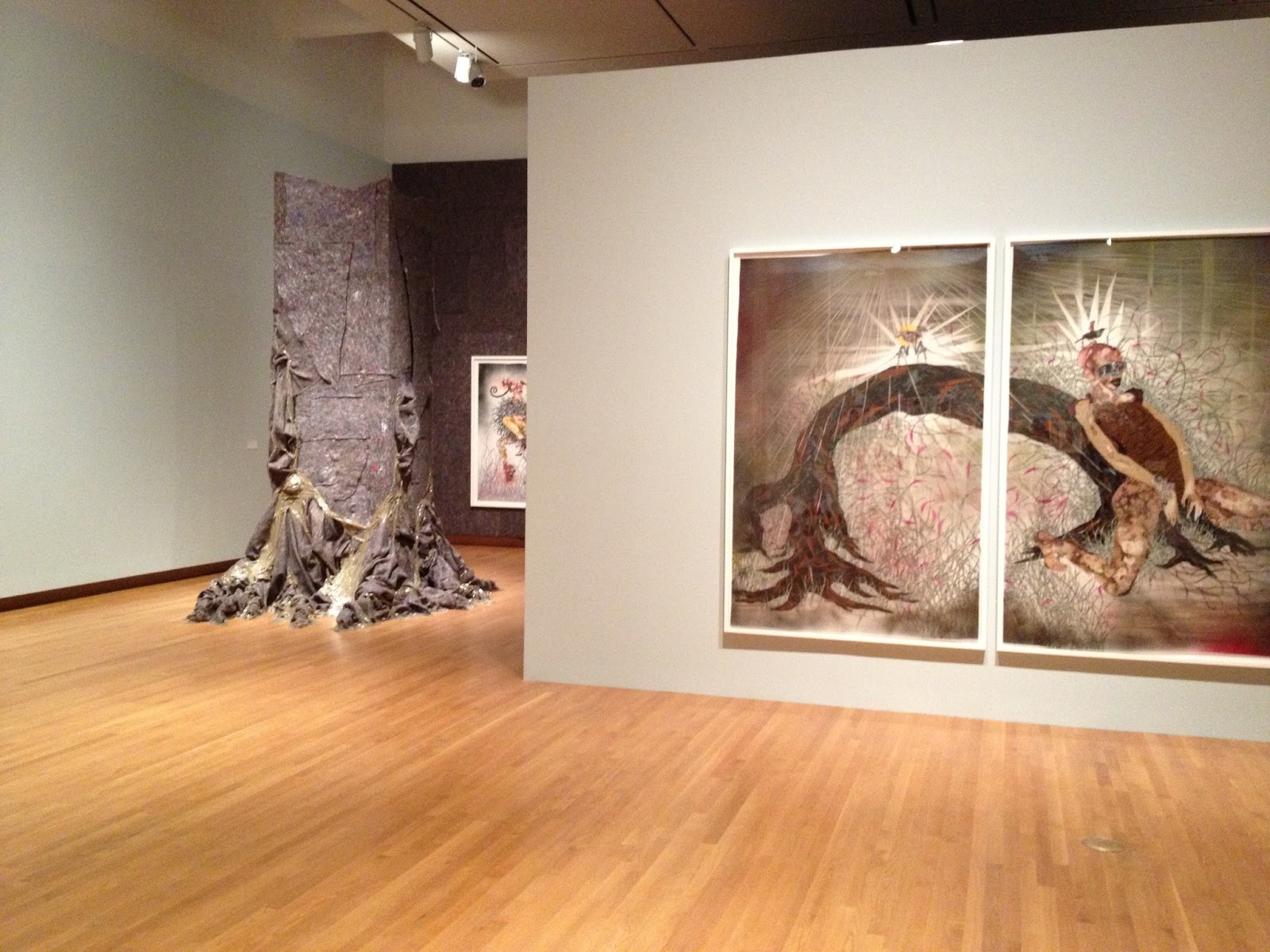
So glad I caught this exhibit, featuring 15 years of work by African-born, Brooklyn-based artist Wangechi Mutu.

A search for female identity through collage, paint, video art, and installation. When you first walk in, you become aware of the sounds in the room. Nature, singing, roars, and waves, coming from various videos playing throughout the space; it really created a unique atmosphere for looking at her work.

I became completely obsessed with the way she incorporated this felted, recycled, almost-industrial fiber with her art, using it to cover entire walls. In one way, an art show is simply hanging art on walls, in Mutu's way, she thought beyond the typical, creating atmosphere and texture by using this textile. I was so inspired and you KNOW I love a good textile. What can I say, it perfectly complimented her work.

We all agreed this video was amazing. I mean, c'mon, she projected from the ceiling onto wood pallets that were sitting on more fiber. A great way to take this piece to another level, finding a new way for the viewer to watch it. Her press-on 'talons' ripping into a 3-layer cake, a very literal address towards overconsumption; she was absolutely engaging and entertaining. When, as she eats the cake, hair starts to get stuck in her mouth, I found myself giggling out loud. She made me rethink my blasé approach to video art.

Beatiful, huge collage on Mylar paper gave a unique dimension to her work and an interesting texture to her paint.

Love that repeat pattern!

Mutu definitely allows in a certain amount of gore, but her femininity shines through in bright red glitter and high heels!

How gorgeous is this? Her recycled fiber grows down to the floor with the help of packaging tape. 

Being an artist myself, I need to remember that regularly attending exhibits like this is so important, not only to understand what other artists are doing around you, but also for the sheer inspiration and beauty of it all. Not to mention it makes me feel a whole lot better that she's been working on all this for 15 years. I guess my pace is not so slow after all!